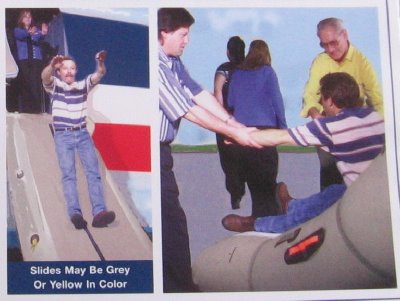
Very few images need glossing, I find, but this is all about the poor execution of a simple idea. These two panels from the emergency instruction card I found on my United Airlines flight point up the very clear fact that not everyone should be allowed to use Photoshop. Foregrounds, backgrounds, and figures all seem to have been imported from different sources. How hard would it have been to photograph an actual person descending an emergency slide? Instead, the fellow on the left could easily be describing how high he'd like a load of cordwood stacked. Certainly he looks nothing like a real person sliding to safety out the door of a jetliner.
And what of the woman behind him? Disturbing. She appears to have shoved him out the door, her wooden expression showing plain distaste. Maybe she's just annoyed that he's ignored the common "women and children first" rule of evacuating distressed passenger vehicles.
In the right-hand panel, the passengers escape into a flat, barren backdrop. But what's that? Check out the woman in blue skulking away as the passenger from the slide is still being helped to his feet. It's the same woman who just shoved him out of the plane! She's everywhere!
Finally, let us please note that "slides may be grey or yellow in color." Do not be confused just because the inflatable rubber surface leading from the side of the plane to the ground is yellow. It's still a slide. Easy mistake to make, of course, if you're expecting it to be "grey." Entrust your life to it anyway. If it is orange, maroon, or aquamarine, you'll just have to take your chances.
Okay. If I've helped to save even one life here today, that will be enough. If not . . . well, that's fine too.


